Originated from Letter P
The icon begins with the shape of the letter “P” — representing Priyappettavar, our Dear Ones.
P

Priyappettavar was created around one simple belief: every dear one deserves someone who cares, stays and shows up. Our logo brings that belief together through a language of embrace, compassion, connection and trust.

The Priyappettavar symbol is intentionally simple — one continuous form carrying several layers of meaning.
The icon begins with the shape of the letter “P” — representing Priyappettavar, our Dear Ones.
At its heart, the icon is the universal gesture of embrace — the purest expression of love, care and protection.
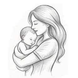
The overall form creates a “C” — standing for Care and Compassion.
While it beautifully reflects the bond between a mother and child, it represents every dear one who cares — mother, father, family member, friend or caregiver.

A single, unbroken line symbolizes infinity — an everlasting, continuous connection with our dear ones.
Deep Blue reflects the depth of the ocean — vast, all-inclusive and endlessly caring. It is also the color of caregiver uniforms worldwide — a symbol of trust, responsibility and selfless service.
Behind the visual identity is a simple commitment to the people who matter most — the people we call our dear ones.
We are here. We care. We stay.